Sustainabite

Sustainabite

Sustainabite

Brand Ecosystem

Brand Ecosystem

Brand Ecosystem

This case study explores the business concept, from brand development to digital presence and strategic positioning.

This case study explores the business concept, from brand development to digital presence and strategic positioning.

The Sustainabite brand promise is to educate restaurants in a positive and informative manner to better understand the importance of sustainable cooking and inspire them to adopt environmentally responsible practices in the kitchen.

Barcelona University

Barcelona University

2 weeks

2 weeks

MUXD MASTERS

MUXD MASTERS

BARCELONA

BARCELONA

The Problem


The problem being explored is the significant amount of food that is discarded or wasted within the restaurant industry. Restaurants prepare more food than necessary to meet customer demand, resulting in excess food that goes uneaten. Plate Waste, Overproduction, Spoilage and Inefficient Kitchen Practices, have become real issues in the kitchen.


Addressing food waste in restaurants requires a few strategies, including menu planning, portion control, staff training, efficient inventory management, encouraging customer awareness and behavior change, and establishing partnerships with food recovery organizations who want to tackle this issue and work towards a sustainable future.

This site was designed as a minimal digital space to let the work speak for itself. The brief was to create a clean, intuitive experience that highlights each project without distraction. The result is a streamlined portfolio that emphasizes clarity, precision, and visual impact.


The problem being explored is the significant amount of food that is discarded or wasted within the restaurant industry. Restaurants prepare more food than necessary to meet customer demand, resulting in excess food that goes uneaten. Plate Waste, Overproduction, Spoilage and Inefficient Kitchen Practices, have become real issues in the kitchen.


Addressing food waste in restaurants requires a few strategies, including menu planning, portion control, staff training, efficient inventory management, encouraging customer awareness and behavior change, and establishing partnerships with food recovery organizations who want to tackle this issue and work towards a sustainable future.

Fonts & Colors

Fonts & Colors

Color

Color

Color

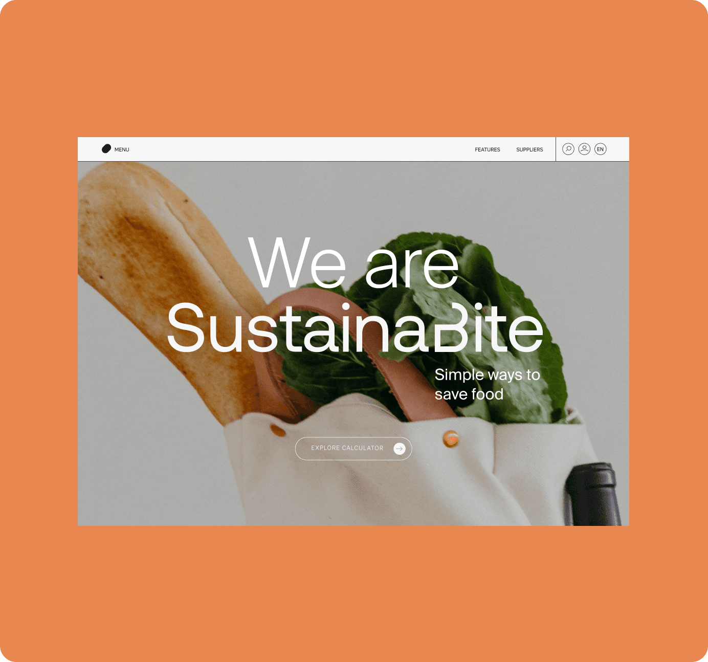
The brand’s color palette was designed to reflect an organic and minimal aesthetic, emphasizing simplicity and calm. Neutral tones create a clean and grounded foundation, while a vibrant pop of orange adds subtle energy and warmth, evoking creativity and a sense of approachability without overwhelming the design.

#D8D9DB

#D1CEBB

#E88750

#1D1D1B

Font

The brand uses Suisse Int’l, a minimal and modern typeface chosen for its clarity, versatility, and timeless aesthetic. Its clean lines support a sustainable design approach by ensuring consistency and legibility across all platforms, making it an ideal choice for a cohesive and scalable design system.

Suisse Int'l

Suisse Int'l

Suisse Int'l

Suisse Int'l

Suisse Int'l

Suisse Int'l

Suisse Int'l

Suisse Int'l

Suisse Int'l

Suisse Int'l

Suisse Int'l

Suisse Int'l

Gallery

Figma Link

Figma Link

Figma Link

explore more about this project

Bronlasarow@gmail.com

Barcelona, Spain

Los Angeles, USA

Cape Town, South Africa

Let's chat more if you would like to connect?

2025 ® Bronwyn lasarow

Bronlasarow@gmail.com

Barcelona, Spain

Los Angeles, USA

Cape Town, South Africa

Let's chat more if you would like to connect?

2025 ® Bronwyn lasarow

Bronlasarow@gmail.com

Barcelona, Spain

Los Angeles, USA

Cape Town, South Africa

Let's chat more if you would like to connect?

2025 ® Bronwyn lasarow

Bronlasarow@gmail.com

Barcelona, Spain

Los Angeles, USA

Cape Town, South Africa

Let's chat more if you would like to connect?

2025 ® Bronwyn lasarow