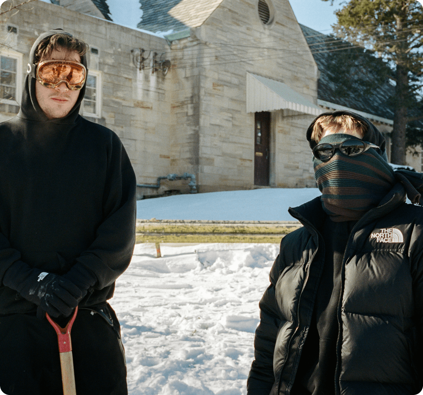
An independent digital outlet embracing an ever-changing media landscape, supported by a select group of brands. Torment value their readers immensely and aim to provide content that isn’t halved by bullshit, but instead packed with the visuals and narratives that represent a view of snowboarding.

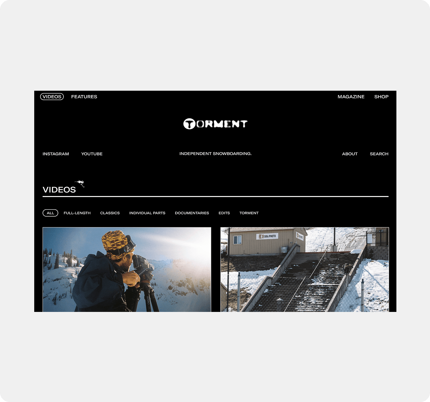
The site uses a black and white color palette to keep the focus on the content. This minimal approach ensures that photos, videos, and stories stand out, creating a clean, distraction-free experience that lets the visuals speak for themselves.
#F0F0F0
#000000
#E1CCD1
#EBB7DB
Font
A mix of serif and sans-serif typefaces was used to create a more stylized and editorial feel, echoing the look of the print magazine. This combination brings a sense of structure and personality to the site, helping it feel more like a true digital extension of the publication.
Gallery